-
How Artificial Intelligence is Revolutionizing Food Styling
Published by
on
 Continue reading →: How Artificial Intelligence is Revolutionizing Food Styling
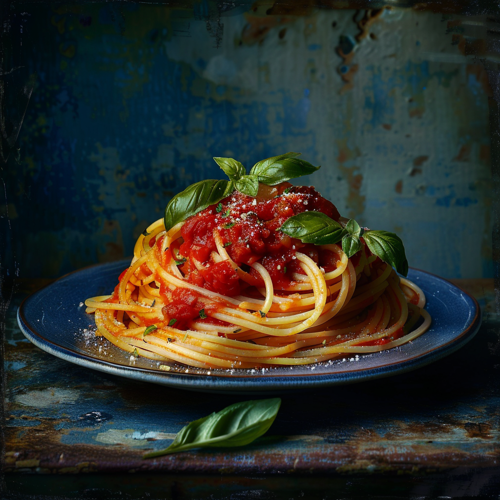
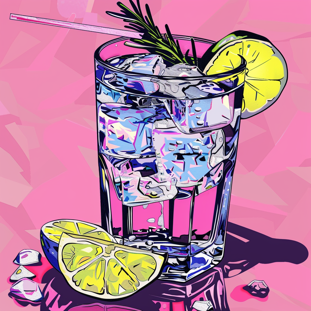
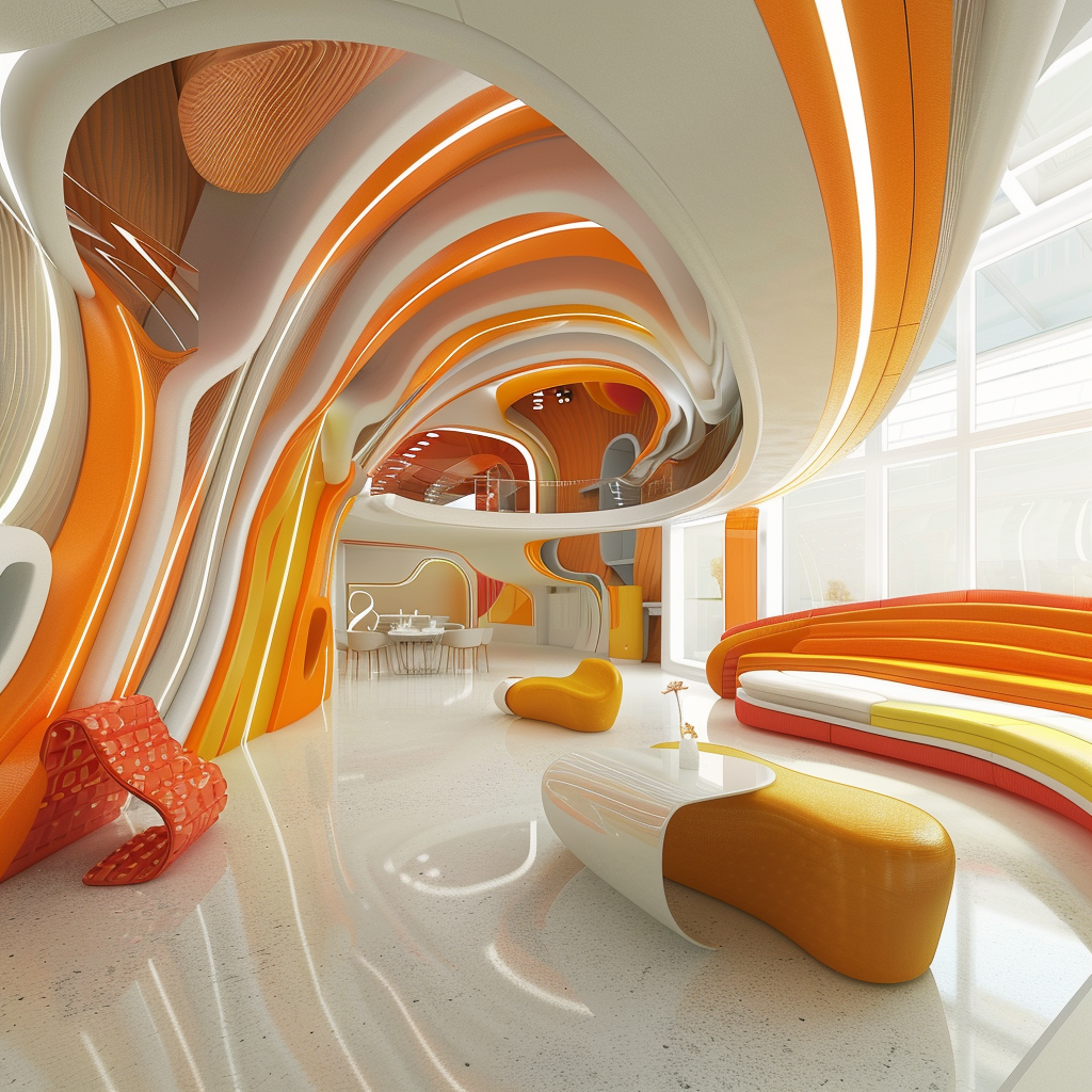
Food photography is an art form, a visual symphony designed to tantalize taste buds and turn a simple dish into a masterpiece. But what if there was a way to overcome creative roadblocks and get that drool-worthy shot every single time? Enter the fascinating world of AI-generated food styling! From…
-
 Continue reading →: Fashion’s Crystal Ball: How AI is Predicting Trends and Designing the Future of Clothing
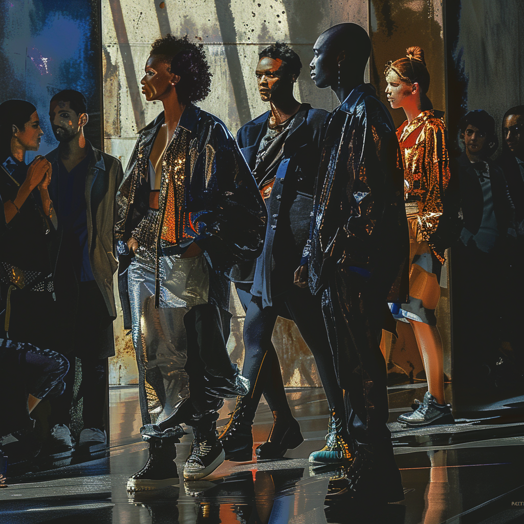
Forget crystal balls and psychics – the future of fashion is being shaped by lines of code. Artificial Intelligence (AI) is rapidly transforming the fashion industry, moving beyond the realm of science fiction and into the hands of designers, retailers, and even consumers. Forecasting the Future: AI as a Trend…
-
The Beauty of Brokenness: My Love Affair with Kintsugi Ceramics
Published by
on
 Continue reading →: The Beauty of Brokenness: My Love Affair with Kintsugi Ceramics
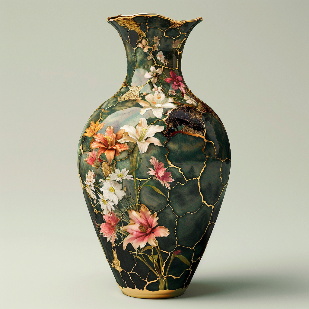
This beautiful Japanese art form takes broken pottery and repairs it with precious metals, like gold or silver. The cracks don’t disappear – they become the star of the show, highlighted in a way that celebrates the object’s history and adds a touch of unexpected beauty. There’s something deeply poetic…
-
Patterns
Published by
on
 Continue reading →: Patterns
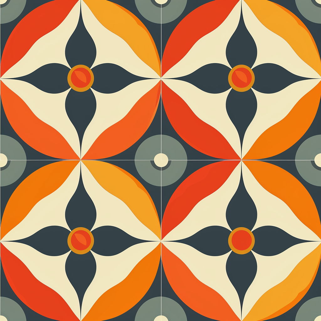
Patterns are everywhere! From the clothes we wear to the websites we browse, these visual elements add life, structure, and personality to our world. But what if there was a way to design patterns faster, more creatively, and even more effectively? Enter the exciting world of AI-powered pattern design! Here’s…
-
Pop Art: From Soup Cans to Your Canvas with a Dash of AI
Published by
on
 Continue reading →: Pop Art: From Soup Cans to Your Canvas with a Dash of AI
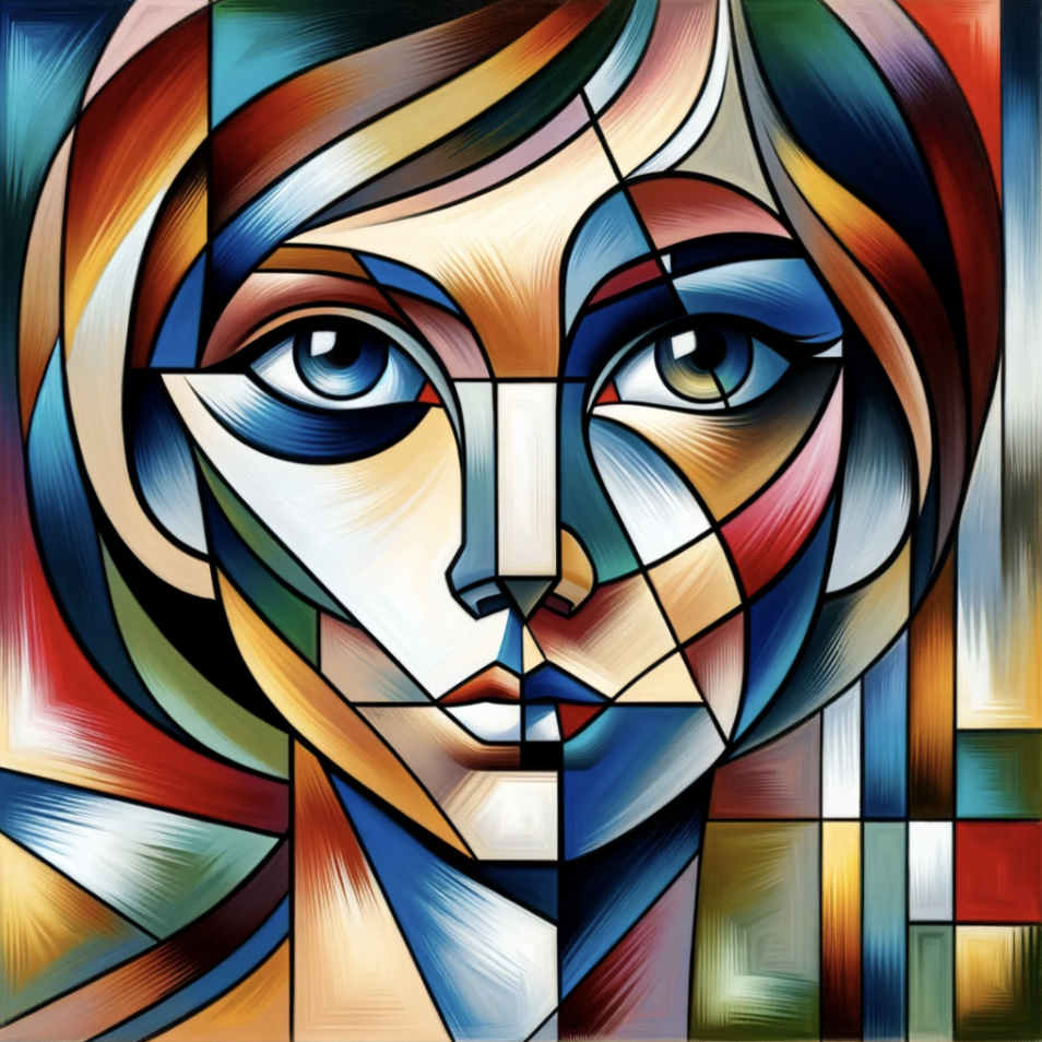
Ever wondered why Campbell’s Soup and Brillo boxes became art icons? That’s the magic of Pop Art, a movement that exploded in the 1950s and 60s. It challenged the elitism of the art world by celebrating everyday objects and mass culture. Think bold colors, graphic imagery, and a healthy dose…
-
Art Nouveau Reborn: A Digital Dance with the Past
Published by
on
 Continue reading →: Art Nouveau Reborn: A Digital Dance with the Past
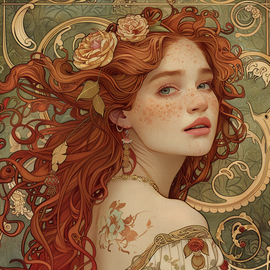
Ah, Art Nouveau. The swirling lines, the organic forms, the way it seemed to capture the very essence of nature and growth. If you’re a fellow Art Nouveau enthusiast, you know exactly what I’m talking about. But this stunning style, that flourished in the late 19th and early 20th centuries,…
-
Dream Sofa? Let’s Make it a Reality
Published by
on
 Continue reading →: Dream Sofa? Let’s Make it a Reality
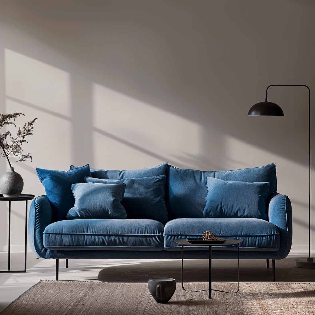
Ever scrolled through endless furniture websites, picturing the perfect sofa but never quite finding it? Yeah, me too. That’s where the magic of AI comes in, folks! Forget cookie-cutter couches, we’re about to design our dream sofa with the help of some artificial intelligence. Here’s how: Step 1: Mind Meld…
-
AI and the future of comic storytelling
Published by
on
 Continue reading →: AI and the future of comic storytelling
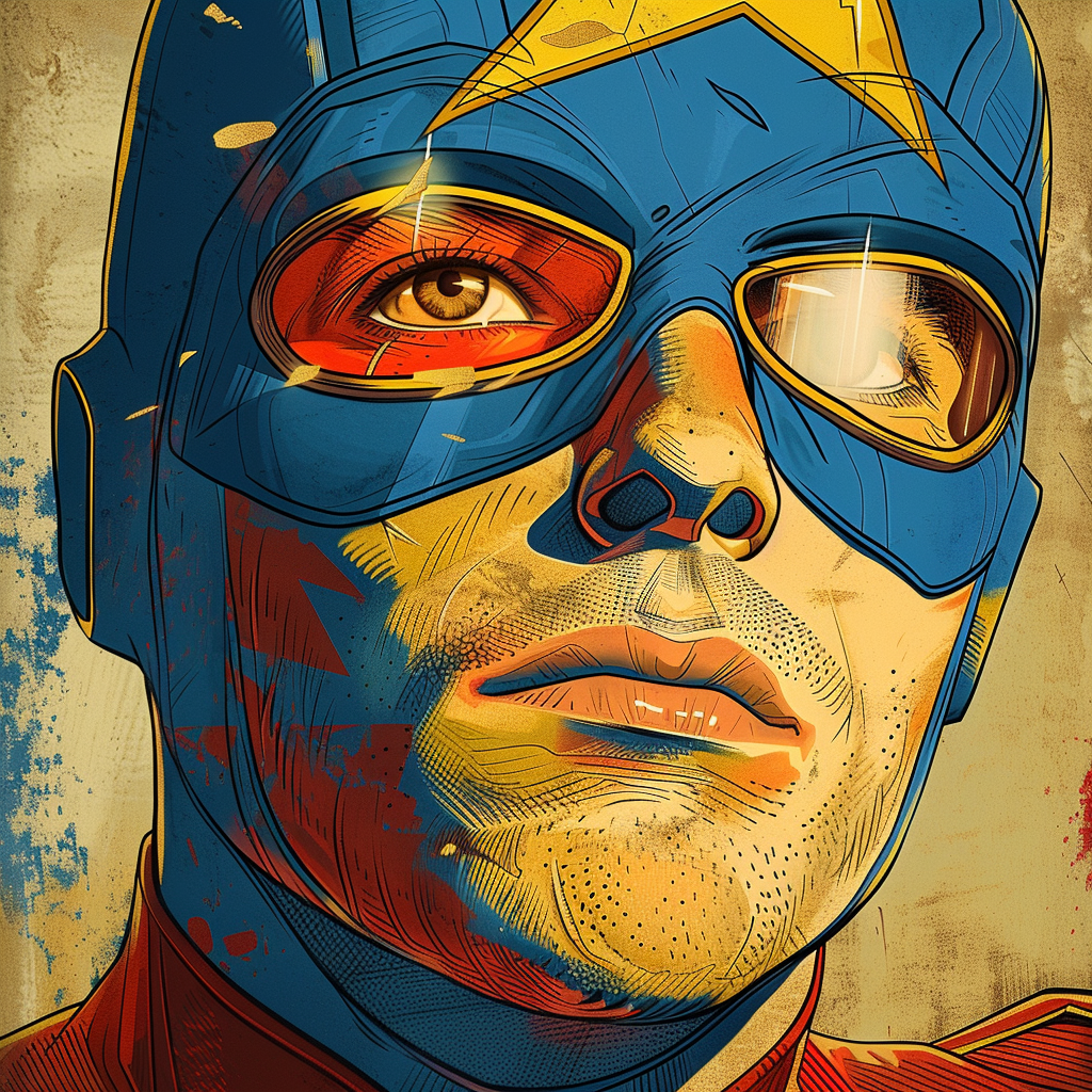
Have you ever wished you could jump right into your favorite comic book? Well, buckle up, because AI might just make that dream a reality! I never been a comic fanatic but lately, I can’t stop thinking about how AI is going to change the game entirely. Imagine comics that…
-
The Future is Here: How Design and Art Schools are Evolving
Published by
on
 Continue reading →: The Future is Here: How Design and Art Schools are Evolving
The educational landscape is constantly adapting, and design and art schools are at the forefront of this change. Fueled by technological advancements and a rapidly evolving creative landscape, these institutions are reimagining the way we learn to create. Let’s peek into the future of design and art schools: The Rise…
-
 Continue reading →: AI Threads the Needle: Revolutionizing Textile Design with Artificial Intelligence
Textiles – the very fabric of our clothing, furnishings, and countless other applications – are undergoing a fascinating transformation. Enter Artificial Intelligence (AI), weaving its way into the design process and creating a future brimming with exciting possibilities. How is AI reshaping textile design? The Human Touch Endures: While AI…
,
Think of this blog as your personal translator between the language of dripping paint and the language of ones and zeroes. We’ll delve into the weird and wonderful ways AI is shaking things up in the art world, from helping artists overcome creative roadblocks to generating portraits of grumpy cats wearing tutus (because, let’s be real, the internet needs more of that).
So, buckle up, grab your metaphorical beret, and get ready for a wild ride where robots might not steal our jobs, but they might just help us create the next masterpiece.
Yours,
Artificially Inspired
Let’s connect
Join the fun!
Stay updated with our latest tutorials and ideas by joining our newsletter.
