-
 Continue reading →: Macarons: Beyond the Pretty Pastels (and Probably Less Fussy to Make)
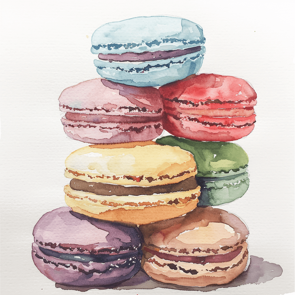
Those adorable, bite-sized cookies in pastel perfection? They’re macarons, and while they might seem like a recent French import for fancy bakeries, their history is surprisingly rich (and maybe a little less fussy than their modern reputation). From Humble Beginnings to Parisian Delight: The origin story gets a little crumbly…
-
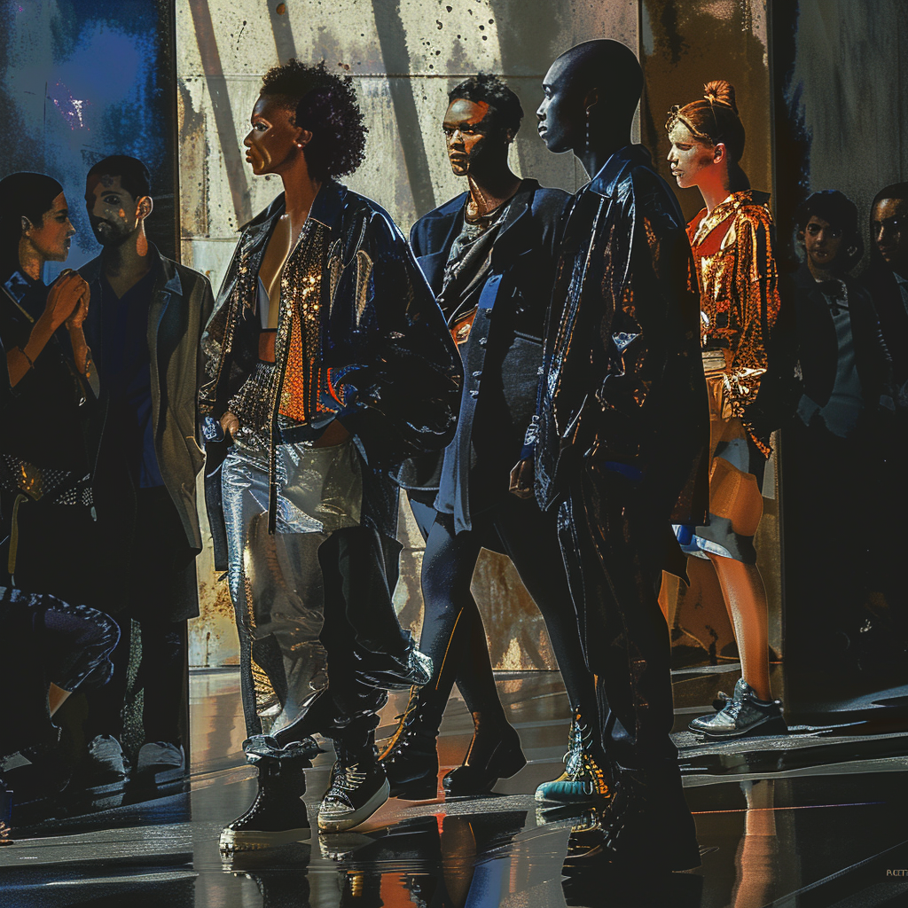
 Continue reading →: Blurring the Lines: How AI is Revolutionizing Mixed Media Art
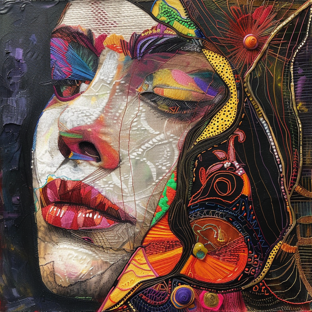
Mixed media art has always been about pushing boundaries, combining traditional techniques with unexpected materials and approaches. Now, Artificial Intelligence (AI) is entering the scene, adding a whole new dimension to this exciting art form. How is AI shaking up mixed media? Beyond the Technology: Examples of AI-powered Mixed Media:…
-
 Continue reading →: How AI Can Help You Rediscover the Joy of Painting
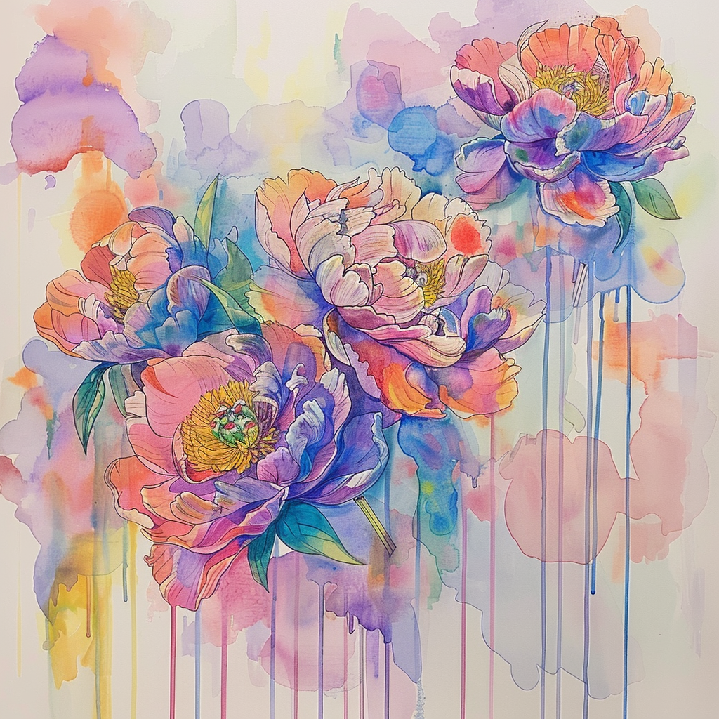
Life can get busy, and sometimes the things we love get pushed aside. Maybe you used to paint all the time, but now picking up a brush feels daunting. Fear not, fellow artist! Artificial Intelligence (AI) can be a surprising ally in your journey back to the world of color…
-
 Continue reading →: AI Can Design Your Dream Bedroom
Is your bedroom more “dungeon” than “dream retreat”? Do mismatched furniture and outdated decor leave you yearning for a sleep sanctuary? Well, fret no more! The future of interior design is here, and it involves Artificial Intelligence (AI). How can AI unlock your dream bedroom? Ready to ditch the design…
-
 Continue reading →: Cracking Open Creativity: The Intersection of Easter Eggs and Art
Eggs! They’re a symbol of new life, a staple of springtime celebrations, and… surprising pockets of artistic expression? That’s right, the humble Easter egg has a long and fascinating history intertwined with the art world. From ancient traditions to contemporary installations, let’s explore how these colorful orbs transcend their culinary…
-
 Continue reading →: Prompt of the week
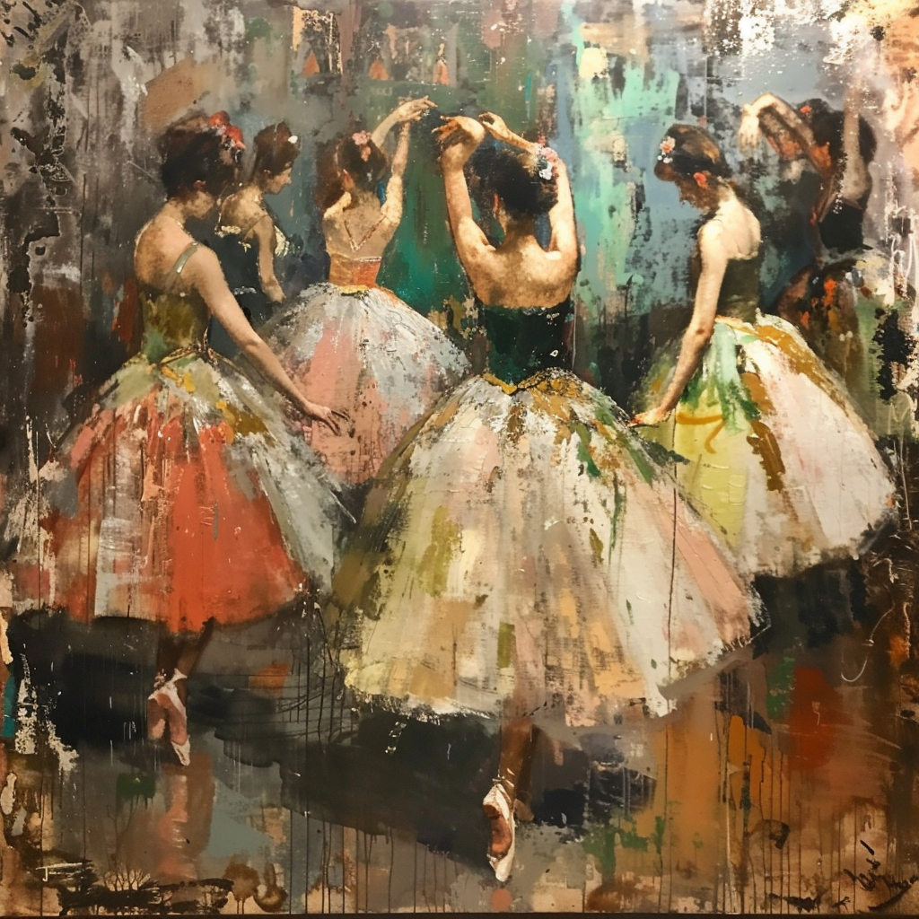
AI Reimagining Classic Artworks This trend involves feeding AI algorithms famous paintings and letting them create new interpretations or mashups. The results can be fascinating and thought-provoking. Here are the Midjourney interpretations for one of my favorite paintings of Edgar Degas the Ballerinas.
-
 Continue reading →: Healing Through Code: The Rise of AI Art Therapy
Traditionally, art therapy has been a powerful tool for emotional exploration and self-discovery. But what if we could combine the expressive world of art with the cutting-edge capabilities of Artificial Intelligence (AI)? Enter AI Art Therapy, a new frontier in mental health that’s taking creativity and healing to a whole…
-
 Continue reading →: Building Greener Cities: AI’s Role in Urban Planning
Imagine a city that breathes easy. Traffic flows smoothly, buildings hum with renewable energy, and green spaces weave throughout the urban landscape. This isn’t a utopian fantasy; it’s the future of sustainable cities, and Artificial Intelligence (AI) is playing a key role in making it a reality. How is AI…
-
 Continue reading →: From Prototype to Perfection: How AI is Streamlining Design Iteration and Testing
In the fast-paced world of design, efficiency is key. Whether you’re crafting a user interface, developing a new product, or shaping a marketing campaign, the ability to iterate quickly and test rigorously is crucial for success. But the traditional design process can be bogged down by repetitive tasks and time-consuming…
-
 Continue reading →: My Newest Studio Buddy?
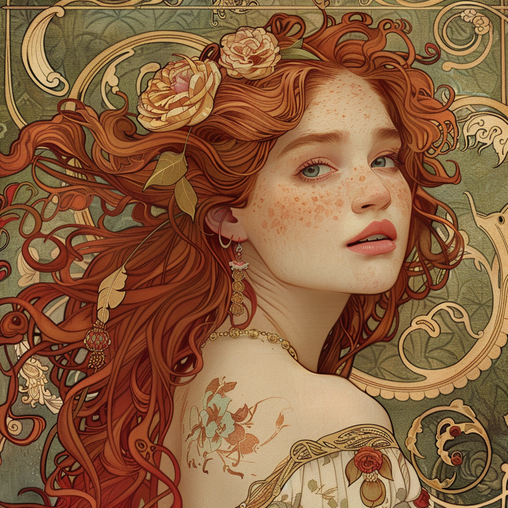
Let’s be honest, the whole “AI is taking over the art world” chatter had me worried. My vision? My control? Kaput! But then something cool happened. I started seeing artists I admire using AI, not as a replacement, but as a freakin’ collaborator. Now, I’m not talking robots with paintbrushes…
,
Think of this blog as your personal translator between the language of dripping paint and the language of ones and zeroes. We’ll delve into the weird and wonderful ways AI is shaking things up in the art world, from helping artists overcome creative roadblocks to generating portraits of grumpy cats wearing tutus (because, let’s be real, the internet needs more of that).
So, buckle up, grab your metaphorical beret, and get ready for a wild ride where robots might not steal our jobs, but they might just help us create the next masterpiece.
Yours,
Artificially Inspired
Let’s connect
Join the fun!
Stay updated with our latest tutorials and ideas by joining our newsletter.